Last Updated on September 16, 2023
Hey, everyone! I hope you have all been staying safe and healthy.
I wanted to share some of my latest blog updates. As you may have noticed, over the span of the last six months, my blog has taken on a bit of a new look.
Blog Updates
Although a few of the changes to my website have been minor, I think many of them were necessary. I’d like to discuss what is new in greater detail and gather your feedback.
As I mentioned, I decided to use the extra time stuck at home this year to really hone in and revamp this website. I’ve been hard at work implementing a ton of changes to tweak my website both on the back end and on the front end since March. I’m definitely leaning more into the travel blog concept, as you’ll soon see.
Front-End Updates
I recognized that it was time to improve aspects of my branding and customizations so what you are viewing here today is the result of what I’ve been working on.
I’m really excited because I think the changes I have implemented so far will help move this blog further along in the right direction. Not to mention, these changes will definitely enable The Rocky Safari to grow faster and more effectively than ever before.
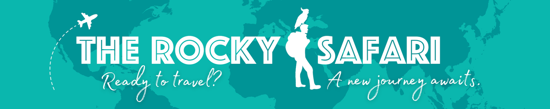
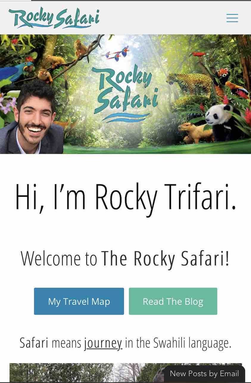
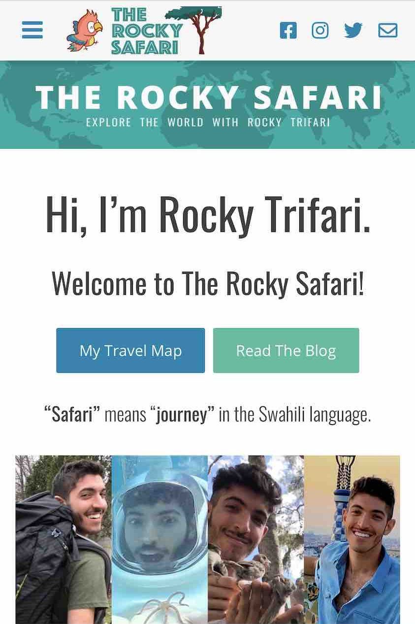
New Logo
First and foremost, The Rocky Safari has a new logo.
I was excited about this change because I think this new design is a much better representation of my interests. I didn’t like how my blog’s previous logo omitted the word “The” since it is included in my domain name so I took to my sketchpad and began to brainstorm new design ideas.
With this new design, I’ve selected a bird because I adore birds and they really have been a great source of inspiration for me. I also thought a bird would tie together nicely with the safari tree and overall theme of my website.
I wanted something that captured a piece of my personality and I felt this design did a pretty good job of that.
New Header Image
I decided to add a new header image as well. This was something I have been wanting to add for a long time and being stuck at home has given me the chance to create and add this customization.
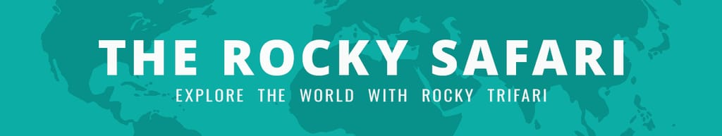
I chose to add a world map to really emphasize how much I enjoy travel and exploration.
New Stylizations
The overall look of my website has been updated as well. I always say that my blog grows as I grow so the time for change has arrived.
After the new logo and header were both implemented, I decided to do a major overhaul and update everything else.
New Landing Page
New Typography
I felt like I was channeling my inner Steve Jobs as I studied various serif and sans-serif fonts to try to decide which “look” worked best with my new blog theme.
Navigating away from the rounded, bubbly letters that I typically gravitate toward was a bit daunting for me but I believe the blocky letters work better with the safari theme.
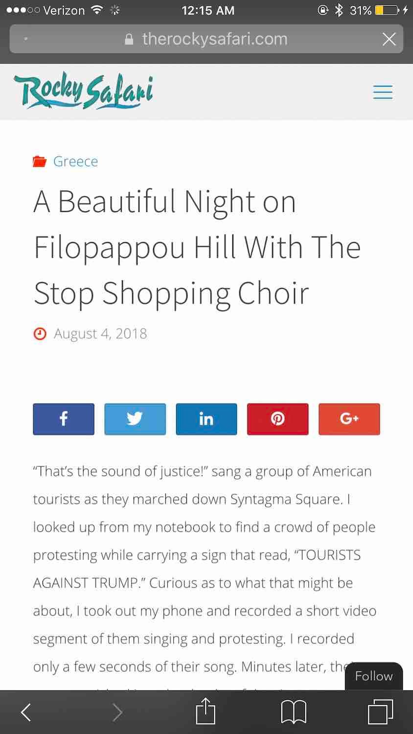
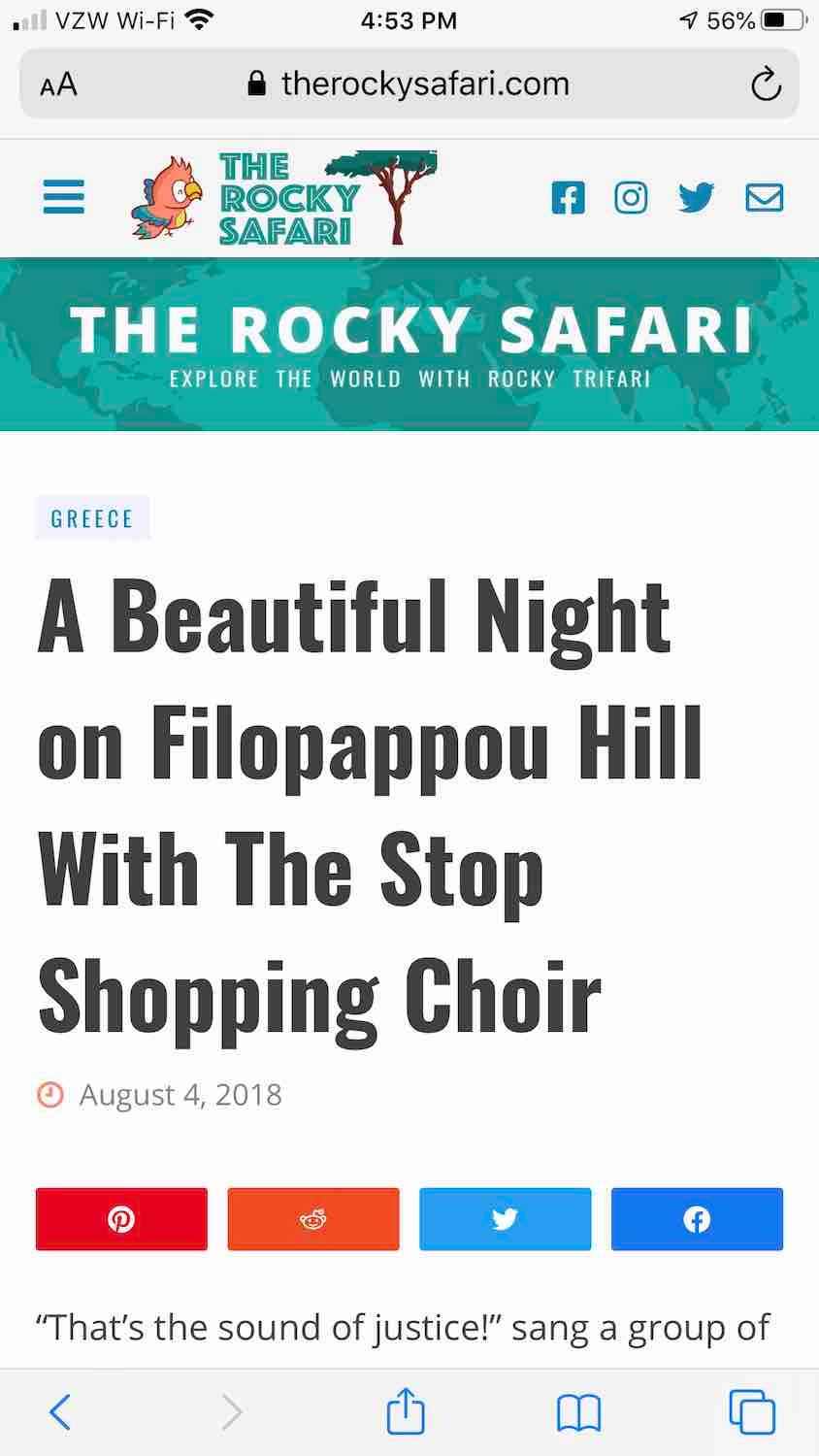
Optimized for Mobile
While my website was technically already “optimized for mobile,” I wanted to take things a step further by really improving the mobile reading experience. I’ve done everything I could to make it more comfortable to read new content from smaller screens.
I hope you’ll find that to be the case.
Improved Readability
Shifting Mobile Menu
I created a new mobile menu that slides in from the side. The menu content is still being developed, but I’m so excited to have the infrastructure in place for this.
Once finished, this mobile menu will be substantially more user-friendly than the previous version.
Social Icons on Menu Bar
I wanted to make it easier for readers to be able to connect with me on social media so now my social profiles are accessible right from the menu bar on mobile.
Optimized for Tablets
My blog is finally optimized for reading on tablet-sized screens. I never had a chance to do this in the past (my apologies, tablet users) so I’m really hoping that people who use iPads and other tablets will find my content much more comfortable to read now.
New Desktop Menu

In addition to the new mobile menu, the desktop site has an all-new, upgraded menu as well! This menu’s content is also a work in progress, but as I mentioned before, I am really excited about this added functionality.
I believe it will be much easier to sort through different sections of my blog once it is complete since I blog about multiple topics.
It is all part of my goal to really reorganize this website and make it much more user-friendly to new visitors.
New Sticky Sidebar
I finally implemented a sticky sidebar. This is a feature I’ve been trying to incorporate for years but struggled to achieve due to incompatibility issues in the past. I have finally found a way to add this feature to my website using this plugin.
View PluginNew Social Share Buttons
Whether you’re using a desktop computer or a mobile device, you will notice new sharing buttons at the bottom of each post. I’ve made it so they float at the bottom of the screen.
I used to also have a specific set of sharing buttons for desktop-only that floated on the left-hand side of the screen. Those have been removed.
The social networks I’m now featuring were selected for your convenience based on which social networks I’ve seen readers use the most on here.
View PluginBack-End Upgrades
New Email Marketing Software
I now use a better platform for email gathering and blog post distribution.
If you want to understand more about why I have chosen to navigate away from my old platform to this new email service, you can read about it on my page: The Ultimate Guide to Email Marketing for Bloggers.
Remember to join my email list if you aren’t already following!
Follow My BlogNew Email Address
Be sure to add my new email address to your contacts to ensure my email messages are never accidentally flagged as spam.
Faster Hosting
My website’s hosting was upgraded to use Google’s Cloud environment. This new infrastructure located in Iowa is built on top of virtual machines instead of bare metal servers. SSDs were fast as they were, but this will take things to an entirely new level. A virtual environment allows for a much faster and more efficient hosting experience. Scaling resources such as CPU, RAM, and storage are much more efficient.
My blog was also given an extra 10GB of storage space thanks to my hosting service all at no additional cost.
Bug Fixes
I’ve done my best to eliminate various little bugs on my website.
For example, the mobile version of this blog used to jump around a lot when you would try to scroll up or down. I’ve done my best to remove that glitch.
If you experience any other bugs, please feel free to report them to me here. I will do everything I can to eliminate them.
Report a BugClosing Thoughts
Overall, I hope you like the direction this blog is heading in! I am always open to feedback and I really hope to hear back from you! Feel free to drop your thoughts in the comment section below or you are welcome to contact me directly via email.
Thanks!
Kudos for using your time to make updates on your blog. This reminded me to check how my blog looks like in mobile and especially in tablet which I never pay attention to. You mentioned before that you’ve changed theme several times. What theme are you using now?
Thank you! Yeah, it can be very easy to forget to cross-check your site’s performance across multiple platforms if you’re not actively using them yourself. Fortunately, Google Chrome makes it easy to test your site on various screen sizes using their Dev Tools. Also, sorry for any confusion about my theme. I use a highly customized theme but when I mentioned that I’ve changed it several times, I didn’t mean the physical WP theme; I actually meant the branding of my blog. The safari/travel/nature theme has been my most recent development in that regard.
I like the new look Rocky!
Thank you so much, Leigha! 🙂